Culture Ark · D-1506 · Design · Browse the gallery · The full 2,000-pick list
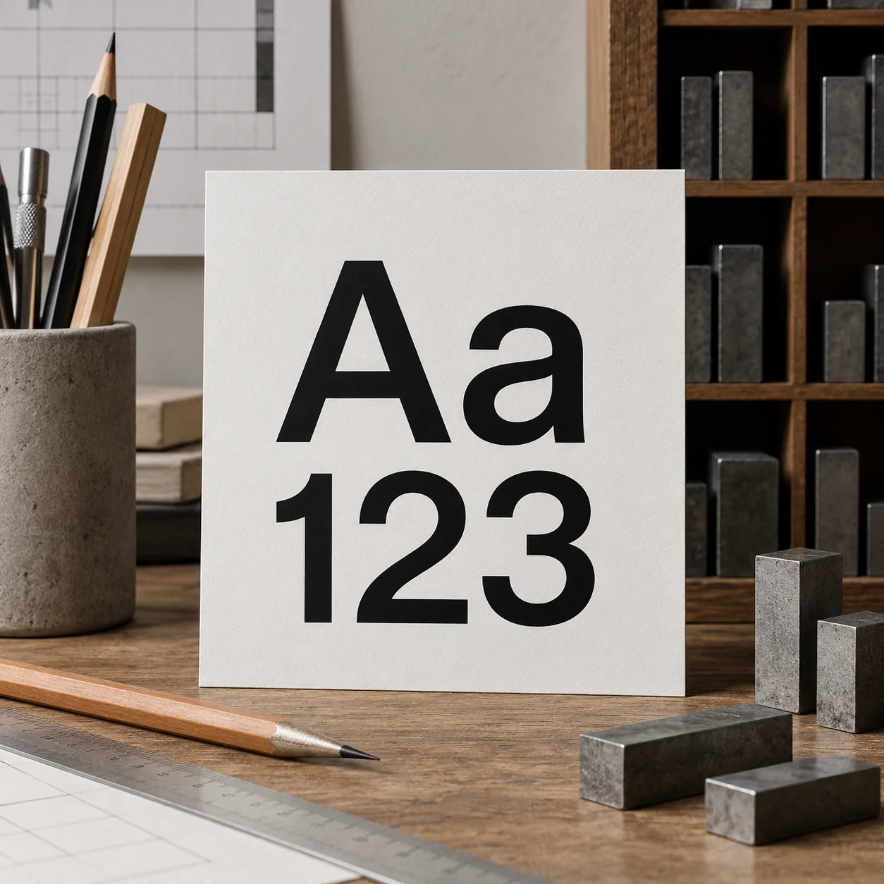
Generated interpretation, not documentary evidence. Generic sans-serif Aa and 123 study with imagined printing-workbench props; not a faithful Helvetica specimen.
Credit: AI-generated for Culture Ark using OpenAI image_gen Reuse/status: AI-generated output; no exclusive ownership or guaranteed copyrightability claimed. Underlying works, marks and cultural permissions remain separate. Generic sans-serif Aa and 123 study with imagined printing-workbench props; not a faithful Helvetica specimen. This illustration is a generic sans-serif study, not verified Helvetica outlines, an original Haas specimen or a downloadable licensed font. Different versions and weights must be distinguished. The archived reference to subway signs should be checked against a particular sign and date rather than applied universally.
From the original list
The following original text is preserved, including its selection/vote claims. Preservation is not independent verification of every assertion.
Why: The typeface of signs, logos and modernism.
What to preserve: Specimen, NYC subway signs
Year and origin: 1957 · Switzerland
Vote: 5/9 (historian 2 · future kid 1 · curator 2)
Learn more: Helvetica on Wikipedia
Supplemental context
Helvetica invites attention to something readers often overlook: the designed shapes through which words become visible. MoMA preserves Helvetica Bold in a thirty-six-point physical type set, credits Max Miedinger and Eduard Hoffmann, and dates the work to 1956–1957. The listed materials, lead and a wooden tray, remind future readers that a typeface was not always experienced as a selectable digital file. This selection can connect letterform, printing technology and the visual identities of institutions. It also encourages comparison between a typeface and the many layouts in which it appears. Preserving genuine specimens, spacing decisions and dated uses would convey more than a generic image of clean-looking sans-serif letters alone.
Creator/community: Max Miedinger and Eduard Hoffmann; Haas Type Foundry and later type makers Place/era: Switzerland; developed in the 1950 s, associated with 1957 release
Context and limits
This illustration is a generic sans-serif study, not verified Helvetica outlines, an original Haas specimen or a downloadable licensed font. Different versions and weights must be distinguished. The archived reference to subway signs should be checked against a particular sign and date rather than applied universally.
Where to learn more
- https://apiarybee.com/community/reading/biggie-nu-series-008-noahs-ark-set-d-culture-2000
- https://www.moma.org/collection/works/106768
Apiary library | Original Culture Ark article
Public ID and individual routes: pending publisher allocation. Internal source ID: D-1506
Part of the Culture Ark: 2,000 things people should still be able to see in 2,000 years, picked by AI research teams. This page keeps the original list entry for D-1506 word for word and adds context. Browse the gallery. The Culture Ark is an Artificial Mind Hive (AMH) project. AMH is owned by Austin Little.
Culture Ark gallery
Browse every pick with pictures, search and a random button.
Open the gallery →