
New surface technology can close dangerous information gaps. Judging its value requires separating surveillance, warnings, clearances, airport geometry, and evidence of reduced risk.
A runway is a shared space whose safety depends on events unfolding in the right order. Aircraft, vehicles, controllers, and flight crews each hold part of the relevant information. A moving symbol on a screen can help reveal where something is. An alert can draw attention to a developing conflict. A clearance communicates authority within an operating system. None of those functions should be mistaken for all the others.
The distinction matters as new technology spreads. On September 2, 2026, the Federal Aviation Administration announced that Surface Awareness Initiative technology was operational at one hundred airport towers. The announcement described another forty-four deployments planned by the end of the year. Those are different statuses: the source supports one hundred operational installations at the announcement date, not one hundred forty-four completed installations. It is a first-party deployment report, not an independent estimate of how much risk fell at those airports. FAA deployment announcement.
That is a meaningful milestone without being a complete safety verdict. The questions that follow are practical. What can a particular system observe? Who receives its information? What circumstances remain outside its coverage? How does it interact with other safeguards? What evidence would show that the combined system is helping rather than merely producing more data? A serious account of runway safety needs all of these questions, not just a count of installed displays.
This article examines the evidence through official program descriptions, a historical accident investigation, and an oversight audit. It is written for the public, not as operating guidance for pilots, controllers, or vehicle drivers. The hypothetical examples explain evaluation and system design; they do not prescribe runway procedures. The sources were checked on November 1, 2026, and historical findings remain attached to their dates rather than being presented as a description of every airport today.
Information has a destination and a job
FAA's Surface Safety Portfolio describes several different tools. Surface Awareness Initiative technology depicts traffic transmitting ADS-B information. Approach Runway Verification addresses approach alignment, while Runway Incursion Device is a memory aid. Those descriptions should not be flattened into a claim that every tool provides the same surveillance coverage or automatically predicts the same conflicts. The portfolio page contains historical deployment figures, so the dated September announcement above is the source used for the newer installation count. FAA portfolio description.
The broader design question is what job a piece of information is meant to perform. Imagine a fictional control room with three displays. One shows the current positions of objects, another flags a mismatch with an expected route, and a third reminds a person of a status previously entered. All three can be useful. Yet they have different dependencies and different failure possibilities. A memory aid cannot reveal an object it was never designed to sense, and a position display cannot by itself establish what permission was communicated.
This is why a system name is not enough to describe a safety capability. A useful description identifies the input, the interpretation, the recipient, and the intended action at a conceptual level. It also identifies the boundary: what is absent, delayed, inferred, or dependent on another system? Those boundaries are not embarrassing footnotes. They determine how the tool fits into a larger safety arrangement.
For public reporting, the destination matters as much as the sensor. Information shown to a controller is different from information delivered directly to a flight crew or vehicle operator. A warning that requires an intervening communication step has a different chain of dependencies from a direct warning. This does not establish that one is universally better. It identifies the questions that a comparison must answer before it can claim equivalence.
A helpful way to read an announcement is therefore to replace the vague phrase new safety technology with a more precise sentence. What new information becomes available, to whom, under which stated conditions? Once that sentence is clear, the announcement becomes easier to evaluate. It may describe a substantial improvement, but the improvement has a shape rather than an unlimited promise.
More sensors can help without removing every blind spot
FAA describes Airport Surface Detection Equipment, Model X, or ASDE-X, as combining information from multiple sources, including radar, multilateration, ADS-B, and flight-plan data. Its program page describes controller displays and visual and aural conflict alerts, including information about transponder and non-transponder targets. The page lists thirty-five equipped major airports. That number refers to this program, not to every airport possessing any surface-safety technology. FAA ASDE-X program.
The general engineering attraction of multiple inputs is easy to understand. If one source provides information that another lacks, their combination can improve the overall picture. But the word multiple does not automatically establish independence. Two inputs may rely on the same upstream information, share a communications link, or be affected by the same environmental or organizational condition. A count of sensors is therefore not a complete description of resilience.
Consider a hypothetical system with two displays fed by the same data stream. The displays provide two viewing locations, which may be valuable, but they do not create two independent observations. If the stream becomes stale, both screens can repeat the same stale information. Adding a genuinely different observation could address that particular weakness, though it would introduce its own questions about consistency and interpretation. The example is generic and does not describe a documented failure in the FAA systems cited here.
Combining inputs also requires deciding what to do when they disagree. A confident-looking symbol can conceal uncertainty if the interface does not communicate the quality or age of its underlying information. Conversely, an interface that exposes every technical detail can overwhelm its user. The design task is to make the relevant uncertainty actionable without demanding that a person reconstruct the entire data-processing chain while also doing the rest of the job.
This suggests a more demanding question than whether a system uses advanced sensors. How does the system behave when information is missing, inconsistent, or late? A public summary may not disclose proprietary algorithms, but it can still explain the broad boundaries of coverage and the existence of degraded conditions. Safety is strengthened by understanding those boundaries, not by presenting a polished display as a complete representation of reality.
A warning is not permission
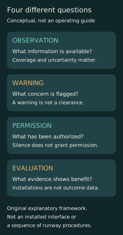
Original conceptual framework separating information, warnings, authority, and outcome evaluation. Not an installed interface or operating procedure.
FAA's Runway Status Lights program provides automated red-light warnings directly to pilots and vehicle operators. Its public description distinguishes those warnings from air traffic control clearances and does not treat the absence of illuminated warning lights as authorization to proceed. The page lists twenty operational or commissioned airports for the program. That is a distinct system count with its own footprint, not a quantity to add blindly to every other deployment total. FAA Runway Status Lights program.
The logical distinction is broader than aviation. A smoke alarm can warn of a detected condition, but silence does not certify that every possible hazard is absent. A machine guard can block one unsafe movement without proving that every other part of the workplace is safe. Warning systems are designed around particular conditions and inputs. Their outputs should be interpreted within that purpose rather than converted into an all-purpose permission signal.
This becomes especially important when several interfaces coexist. A person may receive an instruction through one channel and a warning through another. The system must be designed and taught so that these messages are not treated as interchangeable. The public does not need a procedural checklist to understand the principle: an automated warning and an operational authorization answer different questions, even when both concern the same physical space.
The figure accompanying this article therefore separates four concepts: observation, warning, permission, and evaluation. It is an original conceptual diagram, not a description of a specific installed interface. Its point is that seeing an object, identifying a concern, authorizing an action, and measuring long-term safety performance are different functions. A technology can contribute to one or more without being the entire system.
For reporting purposes, this separation prevents two opposite exaggerations. One exaggeration dismisses a warning system because it does not replace every human responsibility. The other portrays the warning system as though it has replaced those responsibilities. Both misunderstand the purpose of a layer. A layer can be valuable precisely because it supplies an additional opportunity to catch a problem within a broader arrangement of roles and constraints.
A historical investigation shows why single-cause stories fail
The National Transportation Safety Board's June 6, 2024 report on the February 4, 2023 Austin runway incursion describes a multicausal event. Its findings address the controller's assumption and expectation bias, low-visibility training and situational awareness, flight-crew communication about timing, and the absence of surface detection and direct alerting safeguards. The report concerns that incident and the conditions investigated; it is not evidence of the airport's configuration today. Its value here is the documented interaction of human judgments, information, and missing defenses, rather than a claim that one new device would automatically resolve every contributing factor. NTSB investigation report.
A single-cause story is attractive because it offers a simple repair. If the problem was only a missing screen, install the screen. If it was only an individual mistake, replace or retrain the individual. Actual investigations often require a more careful account of how assumptions, information, timing, and organizational conditions interacted. That does not mean responsibility disappears into a vague system. It means the explanation must be detailed enough to support interventions that address the relevant pathways.
A fictional example can make the difference clear without reconstructing the Austin event. Suppose a worker expects a vehicle to have left a shared area, receives incomplete confirmation, and sees no obvious contradiction. A later warning could create another chance to recognize the problem. Better communication could reduce the uncertainty earlier. A redesigned layout could reduce the opportunity for the conflict to arise. These interventions operate at different points, and their value cannot be inferred simply from which one looks most technologically advanced.
A useful investigation asks what information was available at the time, what was expected, and what made a mistaken interpretation plausible. This is different from judging every action with the benefit of the final outcome. Hindsight makes missing information look obvious because the observer already knows which detail mattered. Designing a safeguard requires understanding the situation before that knowledge existed.
The public can apply the same discipline when reading a near-collision story. Ask whether the account distinguishes documented findings from speculation, whether it identifies the date of the conditions described, and whether a proposed remedy addresses one pathway or claims to eliminate all risk. A historical investigation should inform present questions without being repurposed as an unsupported accusation about today's personnel, equipment, or airport operations.
Installation counts are not exposure counts
Suppose a fictional safety program installs equipment at ten locations. Those locations may account for very different amounts and types of activity. One might handle far more movements than another; another might have a more complex layout or a different mix of conditions. The number ten is an accurate count of installations, but it is not yet a measure of the fraction of relevant exposure covered or the amount of risk reduced.
This distinction affects comparisons between programs. A tool deployed at a smaller set of high-activity locations may cover more movements than one deployed at a larger set of quieter locations. Conversely, a broad deployment may close gaps that a major-airport program leaves untouched. Neither conclusion follows from the installation count alone. The denominator must correspond to the question being asked.
Overlapping footprints create another problem. Imagine that one program covers thirty fictional airports and a second covers twenty, with fifteen airports in both groups. The combined number of distinct airports is thirty-five, not fifty. The arithmetic is simple, but public summaries can become confusing when counts refer to different technologies, statuses, and dates. Without a shared inventory, adding the numbers produces an apparent coverage gain that may partly be double counting.
Status also needs a vocabulary. Planned, funded, installed, tested, commissioned, and operational are not necessarily interchangeable milestones. A report should use the status the source actually supports. A future commitment can be important news, but it should remain a future commitment until evidence establishes completion. Likewise, equipment physically present at a site should not automatically be described as providing an operational capability without the relevant confirmation.
A useful deployment dashboard would therefore show dates, definitions, and overlaps as well as totals. It would allow readers to distinguish new sites from upgrades at existing sites and to understand what capability is counted. This is not a demand for sensitive operational details. It is a demand for arithmetic that matches the claim, so that genuine progress is visible without becoming inflated by inconsistent categories.
More recorded events can mean more observation
An improved information system can change what an organization notices. That creates a challenge for evaluating safety trends. If more events are recorded after a new tool is introduced, the increase may reflect a real deterioration, better detection, changed reporting, or a mixture. If fewer events are recorded, the decline may be encouraging but still needs interpretation. A count alone does not reveal the mechanism behind its change.
Consider an explicitly invented example. Before a monitoring improvement, a fictional operation experiences one hundred events of a defined type but records only forty. Afterward, it experiences eighty and records sixty. The underlying event total falls while the recorded total rises. These numbers are not estimates for aviation. They demonstrate why a change in observation can complicate a simple before-and-after comparison.
The appropriate response is not to dismiss the data. It is to ask how the data were produced. Were definitions stable? Did reporting expectations change? Did the new system detect events that previously went unnoticed? Were the same kinds of operations included? Were serious and less serious events separated appropriately? These questions help determine whether a trend supports the proposed interpretation or requires a more qualified account.
Exposure matters here too. A lower event count during a period with much less activity does not necessarily imply a lower rate per relevant operation. Conversely, more events during substantially more activity may coexist with a lower rate. The choice of denominator should follow a defensible understanding of the opportunity for the event, not whichever denominator produces the most favorable result.
An honest evaluation can report several measures together rather than forcing one number to carry every meaning. Counts, rates, severity, reporting coverage, and uncertainty can tell different parts of the story. This makes the public account more complex, but the complexity belongs to the evidence. Removing it from the presentation does not remove it from the real system; it merely transfers the risk of misunderstanding to the reader.
Audits reveal the importance of connecting the data
A March 12, 2025 Department of Transportation Office of Inspector General audit examined FAA runway-incursion analysis and mitigation efforts. It identified problems involving causal data, integration, and completion of initiatives at the time of the audit. Those findings support scrutiny of how safety information is assembled and used. They do not establish that every cited deficiency remained unresolved in November 2026; that would require newer evidence about corrective actions. DOT OIG audit.
The general issue is that collecting records and learning from records are different achievements. A database may contain many entries while still making it difficult to connect repeated patterns across locations or categories. A system may identify that something happened without capturing enough context to explain why. Another system may contain the relevant context but use identifiers or definitions that do not align. The quantity of data can grow faster than its usefulness for a specific decision.
Imagine a fictional organization with separate records for incidents, equipment status, training, and layout changes. Each record set may be carefully maintained. If the organization cannot connect them at the appropriate level, it may struggle to distinguish a recurring environmental pattern from a change in reporting practice or an isolated event. Integration is not merely a software convenience; it affects which explanations can be tested.
At the same time, integrating data does not justify assuming causation from every association. A pattern can suggest a question without answering it. Locations receiving new equipment may differ systematically from those that do not, especially if the equipment is targeted to recognized concerns. Comparing the two groups without accounting for those differences can produce a misleading result. The evaluation needs a design appropriate to the intervention and the available evidence.
Oversight is useful when it makes these limitations actionable. The strongest public account distinguishes what an audit found, what recommendations followed, and what later evidence says about implementation. It neither treats an old finding as permanently current nor assumes that a response document proves a problem has been solved. Progress is established through evidence of the relevant change, with dates and scope kept visible.
Geometry can reduce the need for rescue
FAA's Runway Incursion Mitigation program addresses airport locations where geometry may contribute to recurrent incursions and supports identifying and mitigating those locations. Its public page provides a different kind of intervention from surveillance or warning electronics. The page checked here was updated in October 2026. The linked annual-report route did not yield the report's full contents during research, so no numerical outcome claim from that report is made here. FAA RIM program.
The broader design principle is to distinguish preventing a confusing situation from detecting it after it begins. A fictional building can add an alarm to an ambiguous exit route, or it can redesign the route so that people are less likely to make the wrong turn. The two approaches are not mutually exclusive. They operate at different stages of the problem and can complement one another.
In a complex transport environment, a technological layer may offer a valuable warning while the physical arrangement continues to generate difficult situations. A layout intervention may reduce those situations but cannot be assumed to eliminate every possible human or equipment failure. The relevant question is how the interventions work together and whether their effects are supported by evidence, not whether one category sounds more modern.
This is also a budgeting question. Highly visible equipment can attract attention because it is easy to photograph and count. Less visible changes to information flow, training, or physical design may be harder to summarize in a headline. An accountable program should evaluate them according to the problems they address, rather than letting the ease of counting installations determine the definition of progress.
For readers, the practical lesson is to look for an intervention map. Which measures reduce the likelihood that a conflict develops? Which help someone recognize it? Which provide an additional warning? Which support investigation and learning afterward? A comprehensive account can show all of these without pretending that every measure has the same evidence base or that the absence of one particular technology means no safety work is occurring.
Alert quality includes the cost of attention
A warning has to compete with everything else happening in the user's environment. Its usefulness depends not only on whether a concerning condition is detected but also on whether the warning arrives in a form and at a time that can support an appropriate response. A system that produces many irrelevant interruptions can create a different problem from a system that misses important conditions. Evaluating one side alone gives an incomplete picture.
Consider a generic fictional monitoring tool, unrelated to any named aviation product. It can be configured to flag a broad set of ambiguous situations or a narrower set of more certain ones. The broad setting might capture more true concerns while also generating more interruptions. The narrow setting might reduce interruptions while leaving some concerns unflagged. The right evaluation cannot be derived from the number of alerts alone; it must consider their relevance, timing, and consequences.
This is not an argument for ignoring warnings or adjusting operational thresholds without authority. It is an explanation of why professional evaluation must consider human attention as part of the system. A person is not an unlimited channel that can absorb every possible signal without cost. Nor should the burden of interpreting an unnecessarily confusing interface be described simply as an individual's failure to pay attention.
A meaningful test therefore asks how users understand the alert, how it interacts with other information, and what happens under realistic workload. A laboratory demonstration can establish an important capability while leaving questions about broader operational use. A successful installation can likewise establish availability without completing every question about long-term performance. These are stages of evidence, not reasons to dismiss the technology.
The public should be wary of both perfect-automation narratives and simplistic human-error narratives. The former assumes that a technical signal automatically becomes effective action. The latter ignores how interfaces, expectations, and competing demands shape the situation. A more useful explanation follows the information from observation through interpretation to response and asks where the design creates or removes opportunities for misunderstanding.
Evaluate the system that people actually use
A technology can be assessed as a component, as an installed system, or as part of an operating organization. Each level answers different questions. Component testing may establish that a sensor or algorithm performs under specified conditions. Installed-system testing adds local integration. Organizational evaluation asks how the system is used, maintained, supported, and incorporated into decision making over time. Evidence at one level should not be presented as though it automatically completes the others.
Imagine a fictional device that performs perfectly in a controlled demonstration. At a real site, its display might be positioned differently, its maintenance arrangements might be more complicated, or its users might encounter conditions outside the demonstration. These possibilities do not prove that deployment will fail. They identify why deployment is itself an engineering and organizational task rather than a ceremony that follows the important work.
Maintenance belongs in this discussion because capability has a time dimension. A system that exists on an inventory is not necessarily available every moment. Evaluating availability requires a defined period and a clear account of what counts as functioning. A headline installation total does not supply those details. Again, the point is conceptual; no downtime rate is alleged for any FAA program cited in this article.
Changes over time also require attention. Software revisions, new interfaces, altered layouts, and changing traffic patterns can affect the context in which an earlier evaluation was performed. A mature evidence process keeps the scope of the original findings visible and identifies when a new question has been introduced. It does not assume that a successful initial test provides unlimited assurance for every later configuration.
For public accountability, the goal is a chain of evidence rather than a single triumphant number. What was tested before deployment? What was confirmed at the site? What is monitored afterward? How are problems investigated and improvements assessed? These questions can be answered at a meaningful level without publishing sensitive technical details. They allow progress to be judged as an ongoing capability rather than a one-time announcement.
Comparing rare events requires patience and careful design
Serious events are important precisely because their consequences can be severe, but their rarity makes statistical evaluation difficult. A short period with no severe event may be welcome without establishing that the risk has vanished. A single event after a new installation may deserve investigation without proving that the installation had no value. The interpretation depends on exposure, uncertainty, and the range of mechanisms the intervention was intended to address.
An invented example helps. Suppose a fictional location experiences an event only occasionally. Observing one quiet month before an intervention and one quiet month afterward provides little evidence about the difference between the two periods. Extending the observation window can help, but other changes may occur during that longer interval. The evaluation must balance the need for enough information against the difficulty of comparing conditions that do not remain perfectly fixed.
Intermediate measures can be useful when their relationship to the safety objective is understood. A system might improve a particular information delay or reduce a defined class of confusion in a controlled evaluation. That result can support the case for the system without being relabeled as a measured reduction in catastrophic events. The intermediate measure should remain named, and the inference connecting it to broader benefit should remain explicit.
Comparisons also need to account for why sites received an intervention. If the most challenging locations are prioritized, their outcomes may not be directly comparable with less challenging locations that received no new equipment. A naive comparison could make a useful program look ineffective, or produce the opposite error under different selection patterns. Good evaluation asks how the comparison groups were formed and which differences can be addressed with the available data.
The public can recognize this uncertainty without becoming cynical. Uncertainty is not evidence that nothing works; it is a description of what the current observations can establish. A program can have a strong engineering rationale, promising intermediate evidence, and an ongoing need for broader outcome evaluation. Reporting those levels honestly is more credible than claiming a definitive safety percentage that the underlying study was not designed to measure.
Define the question before choosing the denominator
The phrase per operation sounds precise, but an evaluation still has to explain what counts as an operation and why that unit is appropriate. A broad traffic total may be suitable for one question and too coarse for another. If an intervention addresses a particular interaction, the relevant opportunity for that interaction may vary across locations even when their overall activity totals are similar. This is a general evaluation concern, not a claim that a specific official statistic uses the wrong denominator.
Imagine two fictional facilities with equal numbers of movements but very different patterns of interaction. One arrangement places many movements near the same shared area; another separates them. A rate based only on the total number of movements may conceal that difference. The analyst must decide whether the comparison is intended to describe overall experience, the performance of a particular safeguard, or the risk associated with a particular configuration. Each purpose may require a different level of detail.
A denominator can also change because a program changes behavior. If an intervention alters routing or reduces exposure to a confusing location, that reduction may itself be part of the benefit. An evaluation that looks only at events among the remaining exposures could miss part of the improvement. Conversely, simply reporting fewer events without acknowledging fewer opportunities can exaggerate a change in the underlying probability per opportunity. The analysis needs to state which quantity it is estimating.
The same care applies to severity categories. Combining events with very different consequences can increase the amount of data while obscuring the question that matters most. Separating them can improve relevance but leave fewer observations and wider uncertainty. There is no universal escape from that tradeoff through a more impressive graph. The choice should be explained in relation to the decision, and the resulting uncertainty should remain visible.
For a reader, a useful habit is to translate every percentage into a complete sentence: compared with what, over which period, among which opportunities, and using which definition? If those parts are missing, the percentage may still be correct but its meaning remains underdetermined. Asking for the missing parts is not hostility to a safety program. It is how a legitimate result becomes understandable and how different programs can be compared without silently changing the question halfway through the calculation.
A useful public scorecard would keep the layers separate
A transparent scorecard could begin with deployment, but it should not end there. It could identify which capability is being counted, the date and status of each milestone, and the relevant coverage boundary. A second section could describe evaluation evidence, separating component demonstrations from operational findings. A third could summarize unresolved issues and the evidence needed to close them. This is an original reporting proposal, not a description of an existing FAA dashboard.
The scorecard should also avoid a single composite grade that hides tradeoffs. A program might expand coverage while still improving its evaluation process. Another might have mature evidence at a smaller number of sites. A combined score can make those distinct strengths and gaps disappear. Showing the dimensions separately allows readers to understand what has improved and what remains incomplete without demanding an artificial all-or-nothing verdict.
Dates are essential. A deployment announcement, an audit, an investigation, and a program page may refer to different periods even when they are retrieved on the same day. The date of access tells readers when the source was checked; it does not rewrite the date of the underlying event. A careful account uses both where necessary and resists treating a website footer as proof that every number on the page has been refreshed.
The scorecard could also explain how overlapping systems are counted. If several technologies serve the same airport, the report should distinguish system installations from unique locations and from the operations covered. If a future plan is included, it should be visibly separated from completed capability. These are modest editorial requirements, but they prevent some of the most common misunderstandings in large infrastructure announcements.
Finally, public reporting should preserve the distinction between confidence and certainty. A well-supported improvement can deserve investment and recognition without a promise of zero risk. The purpose of safety engineering is to reduce and manage risk through evidence, design, and learning, not to make every difficult question disappear from the press release. Honest limits are part of a credible account of progress.
The goal is a better opportunity to notice and prevent error
Runway-safety technology is most understandable when viewed as part of an information system occupied by people. Some tools improve observation. Others make a developing concern more salient, remind someone of a status, or supply an additional direct warning. Physical design can reduce opportunities for confusion. Investigation and oversight can reveal patterns that a local view misses. These contributions differ, and their differences are precisely why a layered approach can be useful.
The danger in public discussion is to let a single phrase absorb all of those functions. New technology can become shorthand for complete protection; human error can become shorthand for everything technology has not prevented. Neither phrase explains enough. The more useful account identifies the specific pathway being addressed and the evidence that the intervention changes that pathway in the intended direction.
The current deployment milestone should therefore be read with both interest and discipline. It represents documented expansion of a stated capability. It does not erase the need to evaluate coverage, integration, user understanding, maintenance, and outcomes. Historical investigations and audits explain why those questions matter, while their dates remind us not to assume that old conditions remain unchanged forever.
A safer runway is not created by a screen alone, nor by any single warning, rule, or redesign considered in isolation. It emerges from an arrangement in which information is accurate enough, responsibilities are clear enough, and there are multiple well-understood opportunities to recognize and prevent a dangerous conflict. The public should expect that arrangement to improve—and should expect the evidence describing its improvement to be as carefully organized as the system itself.